︎ Overview
Trinity Place Shelter is a great organization whose “mission is to help homeless lesbian, gay, bisexual, transgender or queer (LGBTQ*) youth and young adults in New York City to safely transition out of the shelter system and grow into independent, positive, and productive adults.”
UX Methodologies
Affinity Mapping | Persona Development | Journey Map | Design Studio | Usability Testing & Report | Screener Survey | User Interviews | Research Synthesis | Rapid Prototyping | Wireframe Development | Developer Hand Off
Tools Used
Figma | Sketch | InVision | Miro | Keynote | Zeplin
︎ The Approach
︎ Challenge
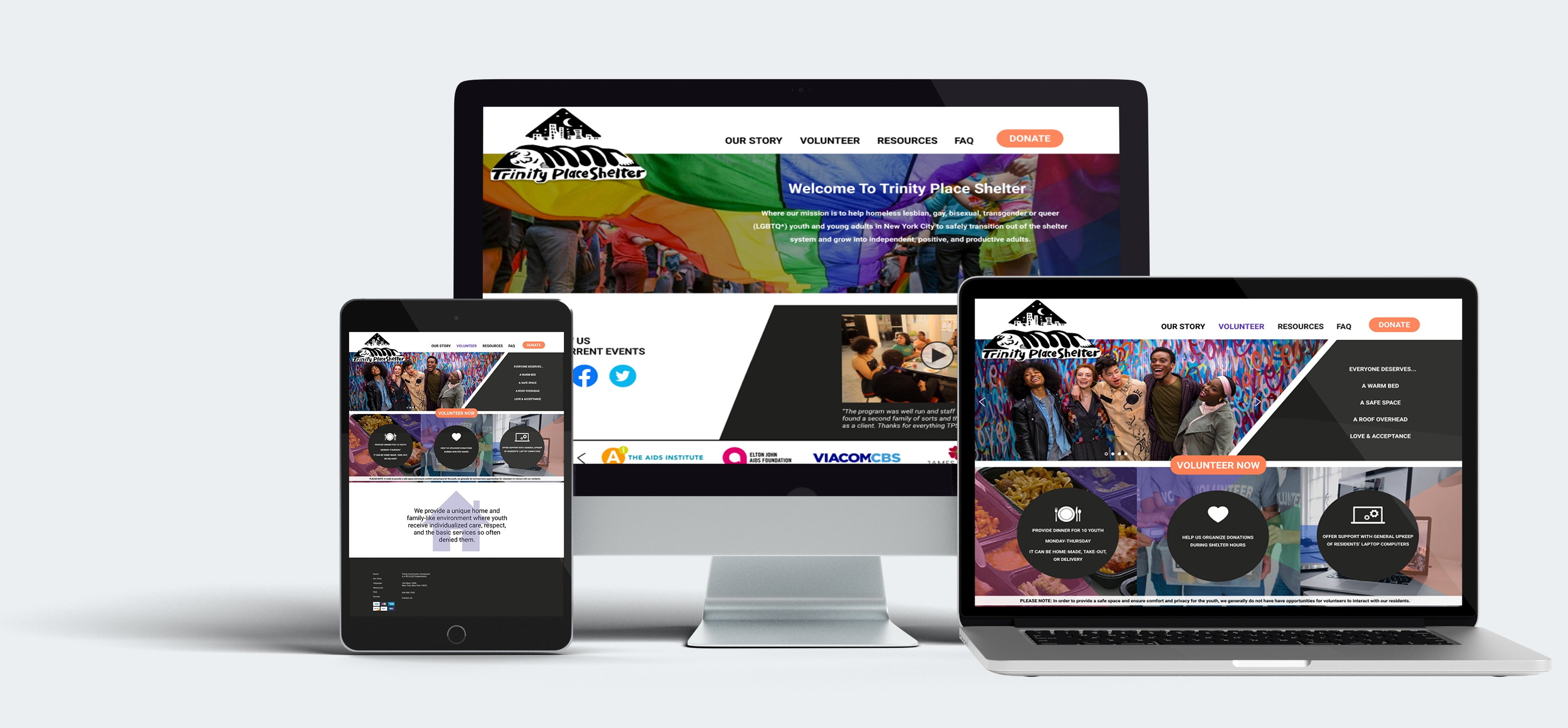
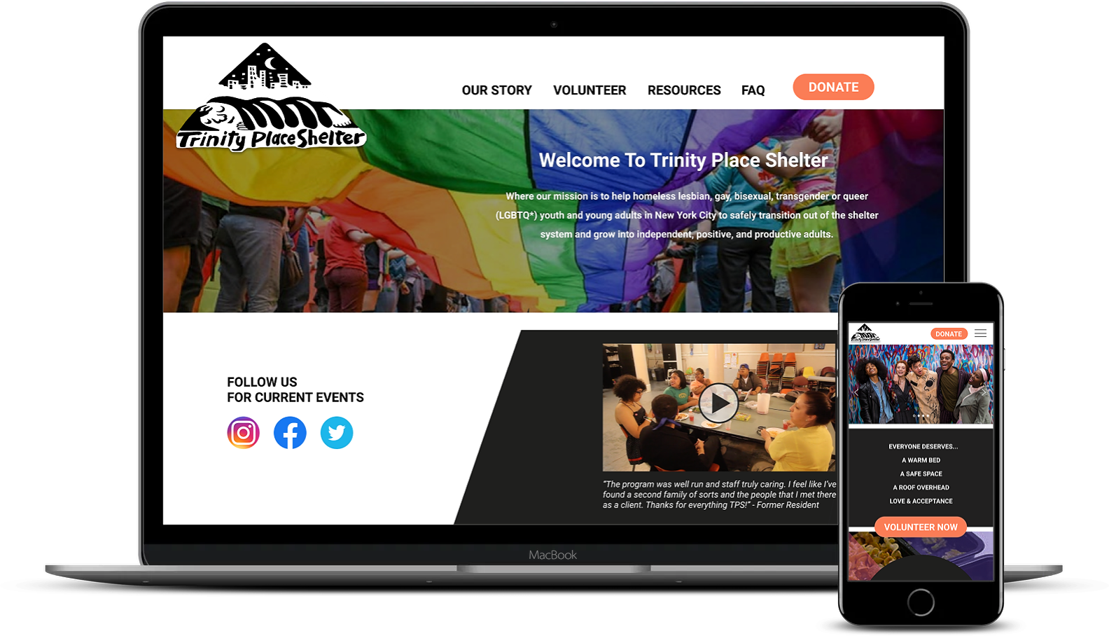
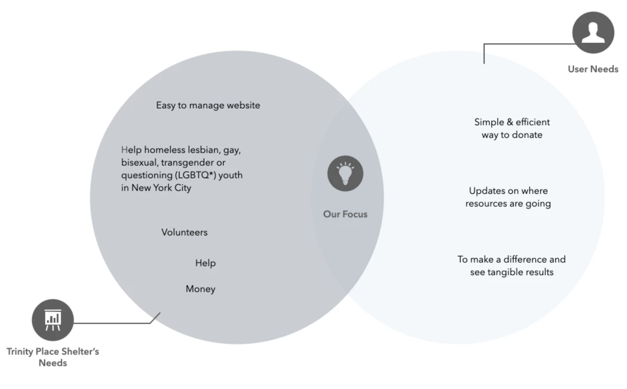
An initial redesign of Trinity Place’s website, with specific focus on two of pages: Home Page and Volunteer page, with special attention to the site organization and primary categorical navigation as a whole.
Amidst a global pandemic, websites are now one of the main portals of contribution for organizations like Trinity Place, thus the goal was to ensure that through a redesigned website we could help others, help Trinity.
︎ User Research
User Interviews / Affinity Mapping
A screener survey was developed to find five users who have donated and/or volunteered in the past year and were somehow involved with the LGBTQ community. Naturally, it was imperative to find out the how and the why when it comes to providing time and resoures to organizations like Trinity Place.
After interviewing the screened candidates, an Affinity Map was developed that highlighted Key Takeaways.
Usability Testing
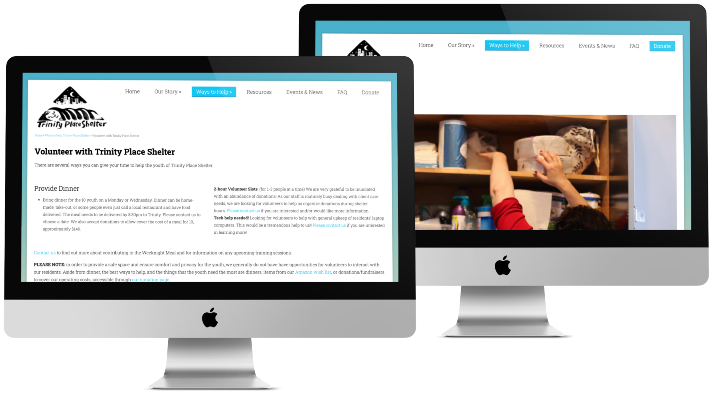
In further pursuit of understanding the user, and their experience in the current site, a round of usability testing was conducted to discover current interactions and potential opportunities and user pain points.
Usability Results:
︎ Initial impressions of site aesthetic and organizational structure was “offputting” and a “challenge to navigate” with too many “blocks of jarring text.”
︎ Lack of images and ration of text and pictures left users feeling a lack of credibility and connection towards the organization and site
︎ Event information such as date and time was difficult to find and in some cases led to other pages also with incorrect, or lack of, information.
︎ Volunteer page was unclear in its and functionality. The link to the page was distracting and did not fulfill its function according to users expectations.
Usability testing brought our users to the front lines to speak to what they are looking for in a site expereince from an organization like Trinity Place Shelter.
Here we meet our Persona Pat, who mirrors our users lifestyle. Pat’s prioritization of needs, preferences, as well as their goals and pain points act as a guiding light in search of empathy with our users.
![]()
After getting to know Pat, we listened to what Pat experienced going through the user cycle on a Journey Map. This would help ensure anything that works well or pain points in current journey in supporting an organization like Trinity Place are brought to light.
![]()
Pat needs a clear and efficient way to learn, validate and give back to Trinity Place Shelter because their time and resources are limited. Pat has a deep desire to contribute to their community, while these organizations congruently need the support.
︎ Persona & Journey Mapping
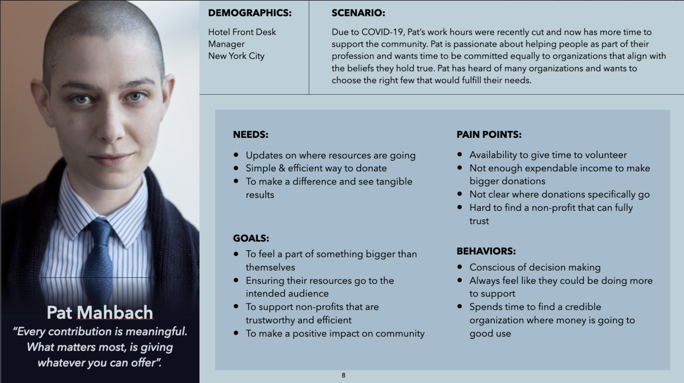
Here we meet our Persona Pat, who mirrors our users lifestyle. Pat’s prioritization of needs, preferences, as well as their goals and pain points act as a guiding light in search of empathy with our users.
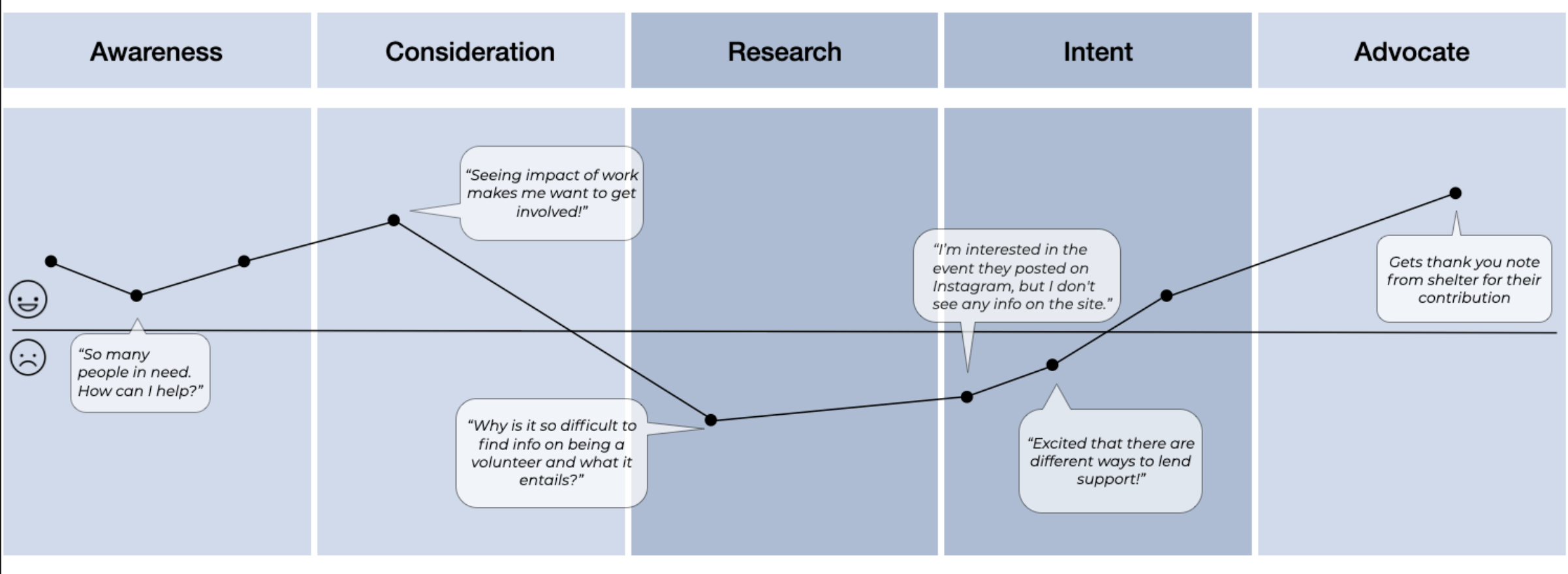
After getting to know Pat, we listened to what Pat experienced going through the user cycle on a Journey Map. This would help ensure anything that works well or pain points in current journey in supporting an organization like Trinity Place are brought to light.
Problem Statement
Pat needs a clear and efficient way to learn, validate and give back to Trinity Place Shelter because their time and resources are limited. Pat has a deep desire to contribute to their community, while these organizations congruently need the support.
How might we improve Pat’s experience navigating Trinity Place Shelter to engage and support the organization in an easy and actionable way?
︎ Design Solution
Feature Prioritization
A priority matrix was created for guiding Design Studio. The following features were addressed with solutions based on prioritization backed by our users feedback and the personas (Pat’s) needs and pain points:
Lo-Fidelity Sketches: Design Studio
Design Iteration occured to create data-backed designs for Home Page and Volunteer Page

Mid-Fidelity Wireframes
Helping to define design, Lo-Fi sketches brought shape and sight to the features our Users have shown they desire from this site. Out of data-backed function choices came form in these Mid-Fi Wireframes showcasing streamlined updates.
The mid-fidelity design and prototype was tested among four users. Participants were given three scenarios and tasks to complete during usability testing.
Key Takeaways
Key Takeaways
- Users found the primary navigation clear and the site overall easy to use.
- Users would like there to be updated event information directly on the site and not have to visit social media.
︎ Prototype & Testing
Key interactions were linked to create mid-fidelity and hi-fidelity prototypes for testing newly designed pages with users. Complete design created including color, typography and style guide development.
Testing & Refinement
This redesign brought many improvements based on the needs and pain points of the original site and Mid-Fi usability testing. After usability testing, some Insights arose regarding this redesign:
Insight:
Users struggled with task of “find current events” looking to social pages for the info they needed, yet didn’t feel this was the best place to find this information.
Recommendation:
Maintain up-to-date event information directly on the site & integrate a News & Events page on the primary navigation.
Insight:
The “Volunteer Now” button is located above the volunteer info; users felt should be after the info as next step without scrolling up once learning the info needed to volunteer.
Recommendation:
Reconsider the placement of the 'Volunteer Now' button to resolve any user confusion.
The “Volunteer Now” button is located above the volunteer info; users felt should be after the info as next step without scrolling up once learning the info needed to volunteer.
Recommendation:
Reconsider the placement of the 'Volunteer Now' button to resolve any user confusion.
Reflection
The relationship of a website to a charitable organization is closer than ever, Websites are now priminent, and many times introductory, portals of information and advocation for these oriognizations. This means that the experience of these sites now hold significantly higher importance than ever before to ensure organizations like Trinity Place can continue to do the great work they do, with the help and support of those so gracious to contribute.
The user is at the center of this entire project. From the imagery and focus on mission on the homepage, to every streamlined and easy to find touchpoint to not only provide infromation easily to the user, but also quickly. In a world changing and evolving quicker than ever so is the user’s attention. Quick, easy, and efficient are what come to mind when one would look at the improvements made to this design.
I am proud of this project, of this opportunity, and of this organization that does so much good for so many good people. Please support orgnizations that help others, like Trinity Place Shelter!
