MUJI
︎ Overview
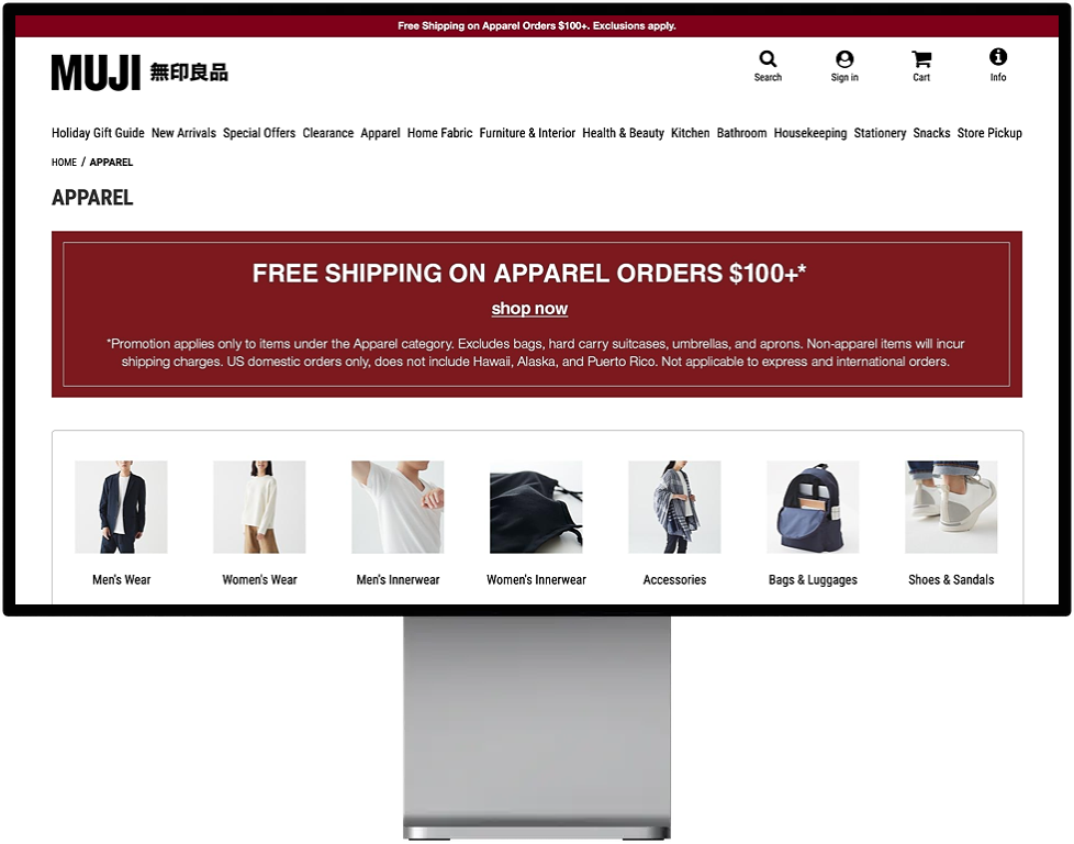
Information Architecture was used to evaluate and conduct testing around the usability and features of the MUJI US Store site. The majority of the analysis of current organization took place in the decisions and potential revisions of the primary and secondary categories. Users were tested through open/closed card sorting, followed by tree testing to begin the users understanding of where they would find a selection of MUJIs products.
“MUJI, originally founded in Japan in 1980, offers a wide variety of good quality products including household goods, apparel and food.”
UX Methodologies
User Interviews | Heuristic Evaluation | Competitive & Comparative Analysis | User Flow and Sitemap | Usability Testing | Open and Closed Card Sorting | Tree Testing | High Fidelity Mockups and Prototyping
Tools Used
Figma | Sketch | InVision | Adobe Illustrator
These methods were used in tandem to create data backed improvements to the usability of the MUJI US Store homepage, specifically looking at the current organization of primary and secondary categories for navigation.
︎ Information Architecture
Heuristic Analysis
This evaluation looks at the website in question through the lens of select few factors, which include Findability, Usability, Valuability, and Accessibility, among others.
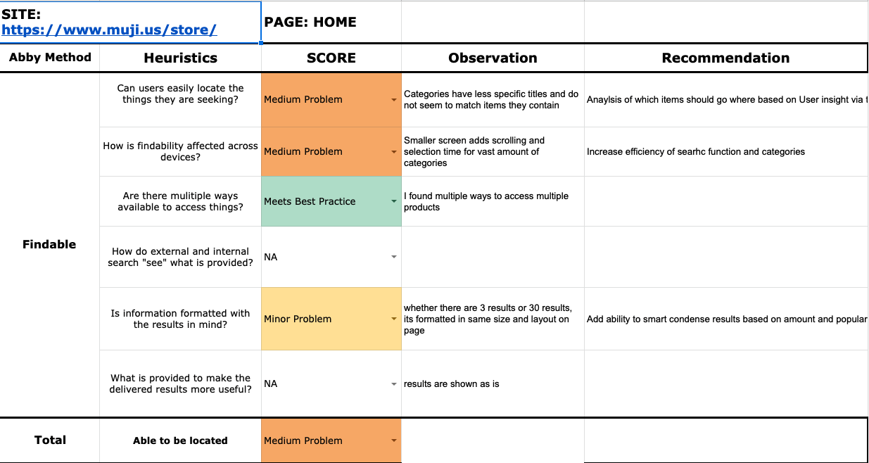
If we pick an example from this Evaluation, you can get an idea of what each page in question goes through to ensure proper evaluation. See below:
Usability:
- Are users able to complete the tasks that they set out to, without massive frustration or abandon?
- Minor Problem — Some errors such as empty categories or low or 1 result per category adds frustration when browsing
- Recommendation: Re-categorize items that are lonely in categorization and 3 clicks away when browsing
Key Takeaways
- While easy to form an opinion about the design, when going through whether rules were violated or not, MUJI did in fact follow many guidelines, even if not in a pleasant or preferred way
- The problems arose in the observations of interactions and navigating a brand with such a vast product offering. This led to testing in how placement of primary and secondary categories can help improve experience.
- Many scores in communication and usability were attributed to layout and placement of site, easability of finding products and search, and category decisions on items sorted for browsing
Comparative & Competitive Analysis
Two competitors and one comparator were chosen to identify features within MUJI’s function to see how they compared to others in their market reach.

Key Takeaways
- IKEA was the most similar in offerings with regard to design, amount of available products, and focus on simplicity and value. This was a key (yet fairly dissimilar) company of comparison with regards to website and functions.
- It brought get insight and context with certain functions, especially the Discount and Purchase Offers that can lead to some great potential future testing and discovery.
User Flows
Development of a User Flow helped gain empathy and context of the User Journey through the site. In this case, it will provide a great visual and bring to light any cogs or obstacles in the user journey in full plain view to observe any recommendations or improvements that can be made.
Task: Purchase Slippers on MUJI US Site

Changes Made:
-
Originally located under Home Fabric, the secondary category of slippers waas removed from this category and combined with the existing Shoes and Sandals seondary category under “Apparel”
-
This new category created under Apparel was revised to be titled “Shoes & Slippers & Sandals

In this example, no additional steps were saved, however initial user research outlined in the Card Sorting data found that some shifting and changes of secondary categories needed to be made.
In the prime instance, Slippers proved by this data that it was not anticipated to be found where it is currently located, This was highlighted in the Open Card Sorting. Slippers, originally in “Home Fabric,” was moved to a new “Shoes/Slippers/Sandals” category.
Card Sorting & Tree Testing
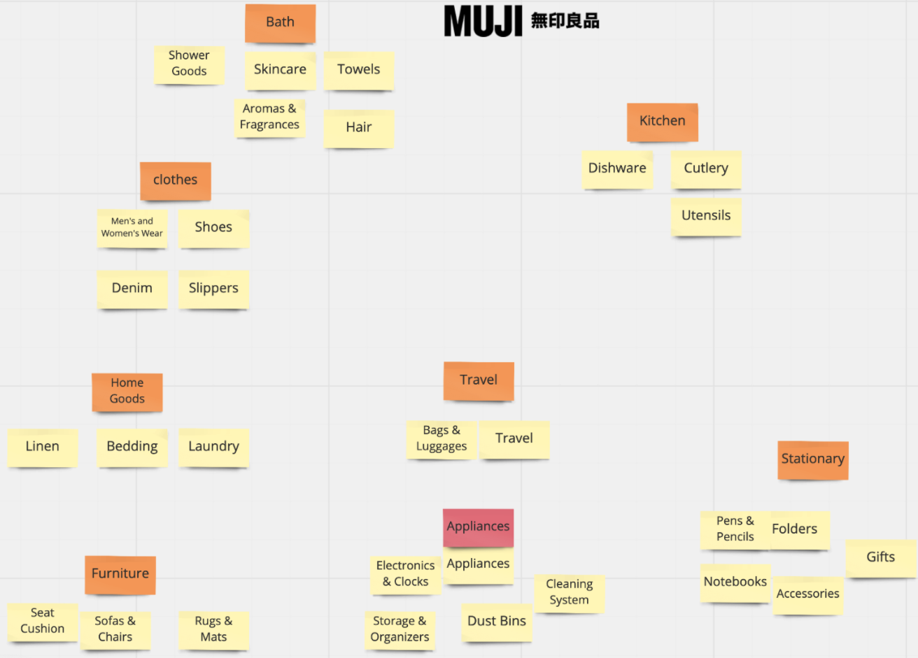
Open Card Sorting is the process of using (in this case up to 30) actual secondary categories from the website and allowing our test users to create primary categories that they feel would best match these in their own grouping. While there were some highlighted differences, the common thread was in footwear being grouped together, as shown below with Shoes AND Slippers.
Additonally, Closed Card Sorting brought similar results using an actual category that, again, slippers was not in. In all three closed card sorts, slippers fell under Apparel.
Observations:
- Categories such as Bathroom, Kitchen, Stationery, and Snacks had users place already existing secondary categories with these in closed and similar titles in Open.
- Most categories were formed quickly, only one was duplicated and only one user felt need for sub categories
- Confusion was mutually evident around placement of slipper

Sitemaps
To suggest improvements using Card Sorting and Tree Testing data, a complete sitemap of the existing infrastructure of the site was developed. This can be viewed as the “Information” part of “Information Architecture” to really see what the building blocks are made of before rebuilding. What sticks out here the most is the abundance of offerings, which is a lot of ground to cover.
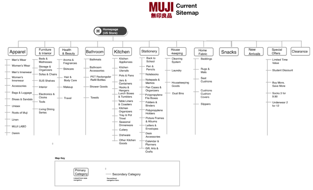
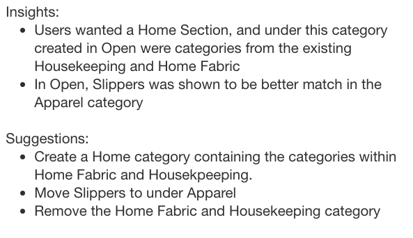
This data showed a shift needed to be made with the removal of the “Home Fabric” category (where slippers live), move the remaining items under a new category (highlighted below) and the creation of another category, “Shoes Sandal and Slippers.“
Prior research showing a large variety of offerings in slippers proved it wasn’t a one offering category and warrants the data backed decision to move it with others it was matched with in testing.
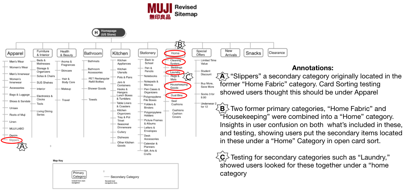
In the annotations above, we see the decisions made were changed based on the data from the card sorting. An unexpected insight was a link to the removal of the Home Fabric category in relation to this move being made, which proved successful in the upcoming Usability Testing.
︎ Design & Testing
While there were many other observations discovered from the card sorting data, a specific feature and finding was chosen to ensure proper testing and a data backed decision of the shift of slippers in a new category.
Hi-Fidelity Design
Usability Testing
Usability Findings:
- 3/3 users completed the task of locating slippers on the (revised) MUJI site
- 1 user mentioned they also thought slippers would be under Furniture & Interior, but did not choose that option
Analysis:
- Adding Slippers under the current two “Shoewear” tertiary options under the primary “Apparel” was in line with previous findings that when card sorting and tree testing and tasked with finding slippers, this would be under the primary category “Apparel”
Recommendations:
- Consolidation of like items also found in testing would be valuable next step in future Hi-Fi testing by product to ease navigation of additional items and improve and speed up the search experience
Reflection
In a time where in-person shopping is virtually non-existent, this is where a retailers e-commerce site and its Information Architecture & UX Design becomes super important, and crucial to optimal success in less than optimal times.
Pending developer and engineer backing from MUJI, further design and testing can be done other features and categories to reimagine the current navigation and layout of the MUJI US store site. My biggest take-away from this is the gentle reminder from Heuristics is that I AM NOT THE USER, and this data backed decision and recommendation means we are amplifying the voice of what the persona of this data would be, and the recommendation made reflects that.
MUJI has unique value share and opportunity in its site design based on the style of its offerings. If you read the “About” of MUJI, it states the following:
“MUJI’s goal is to give customers a rational satisfaction, expressed not with, “This is what I really want” but with “This will do.”
Not the typical line from a company you buy goods from. I believe this can (and has) worked well in its radically simple approach to its offerings, but focus on design and experience can be improved and perhaps contradict this on the surface without conflicting these values. First impressions are imperative and most often representative. If a user doenst make it to the About page when looking for their next great outfit, they will look at the design of their site as their first impression of the brand. From a design perspective, I see this as MUJI’s US store’s sites biggest opportunity.
